Moonfruit - Sitemaker
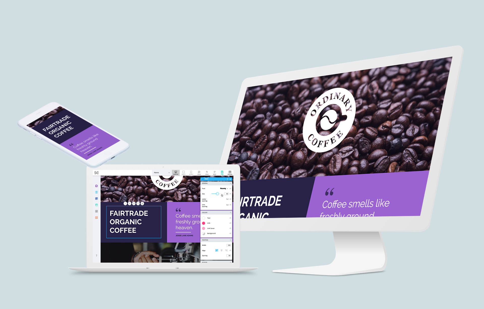
I led the re-design of Moonfruit’s core product; a DIY responsive website builder. Creating an intuitive drag & drop experience for desktop.
Starting from Flash
When Moonfruit started a couple of decades ago, using Flash as the technology behind a website builder made sense. Users, without any knowledge of HTML, could easily build sites by simply placing their chosen content type anywhere on the page. At times this made for some interesting results, but overall users were happy seeing what they had designed come to life on the internet… on a desktop… which, at the time, was really the only place one could look at the internet.
Then smart phones ruined everything (for Moonfruit. Everyone else thought smart phones were great!). As smart phones became ubiquitous, so did the need for web design to move with the times.

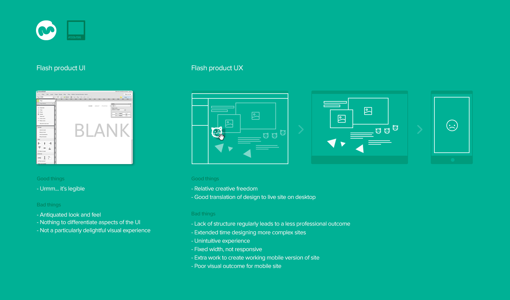
The problems to solve
- Help users to quickly create a responsive website, moving with current trends in technology, with one design working seamlessly across various device types.
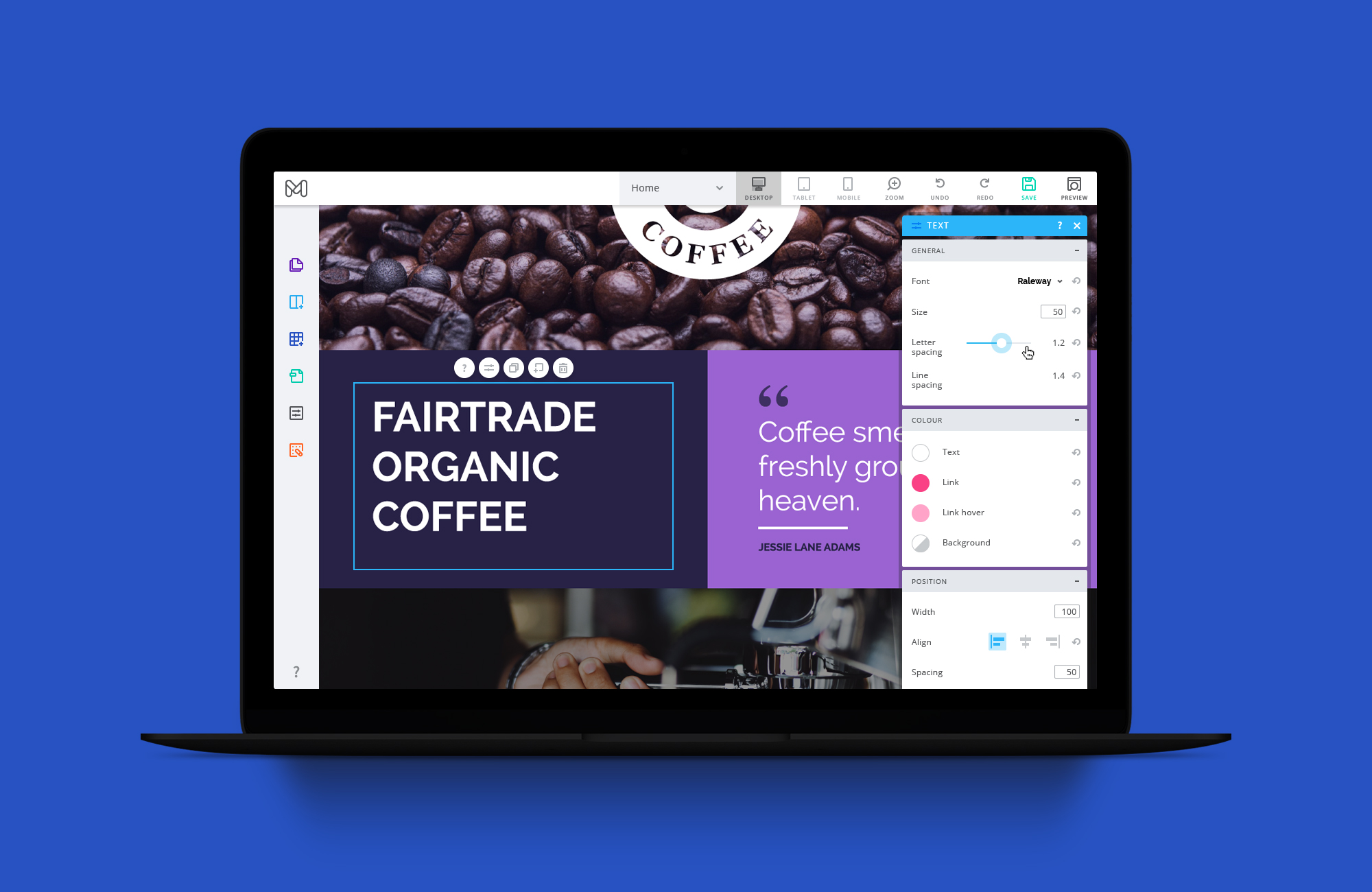
- Overhaul and update UI to fit with current trends. Help the user to navigate the various aspects of the app, rather than everything blending in with itself. Help user’s feel they can put their trust in Moonfruit as a current and up to date company.

Evolution of the UI
Here are some examples of the various iterations of the UI through to the final version.

Starting from Blank
The following is a walkthrough of the initial steps to creating a site using Sitemaker. In this instance, the user starts from the Blank (empty) template, wishing to build their site from scratch.


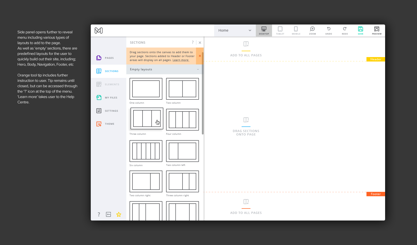

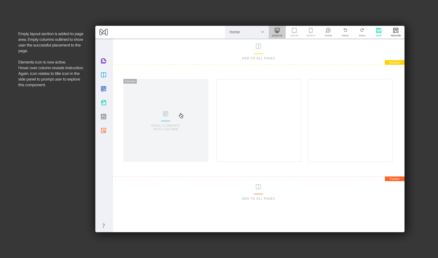


Side panels
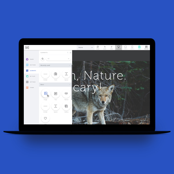
Here are the other panels from the main side bar.


Organising pages
Managing pages across the user’s site all happens in the ‘Pages’ tab in the left side panel. This includes; adding, rearranging, set page type and page design settings


Popups
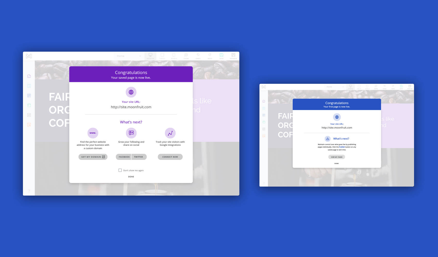
Here are an example of a couple popups.
Icons
Icons were designed to be consistent throughout the editor.
