UENI - Analytics UI
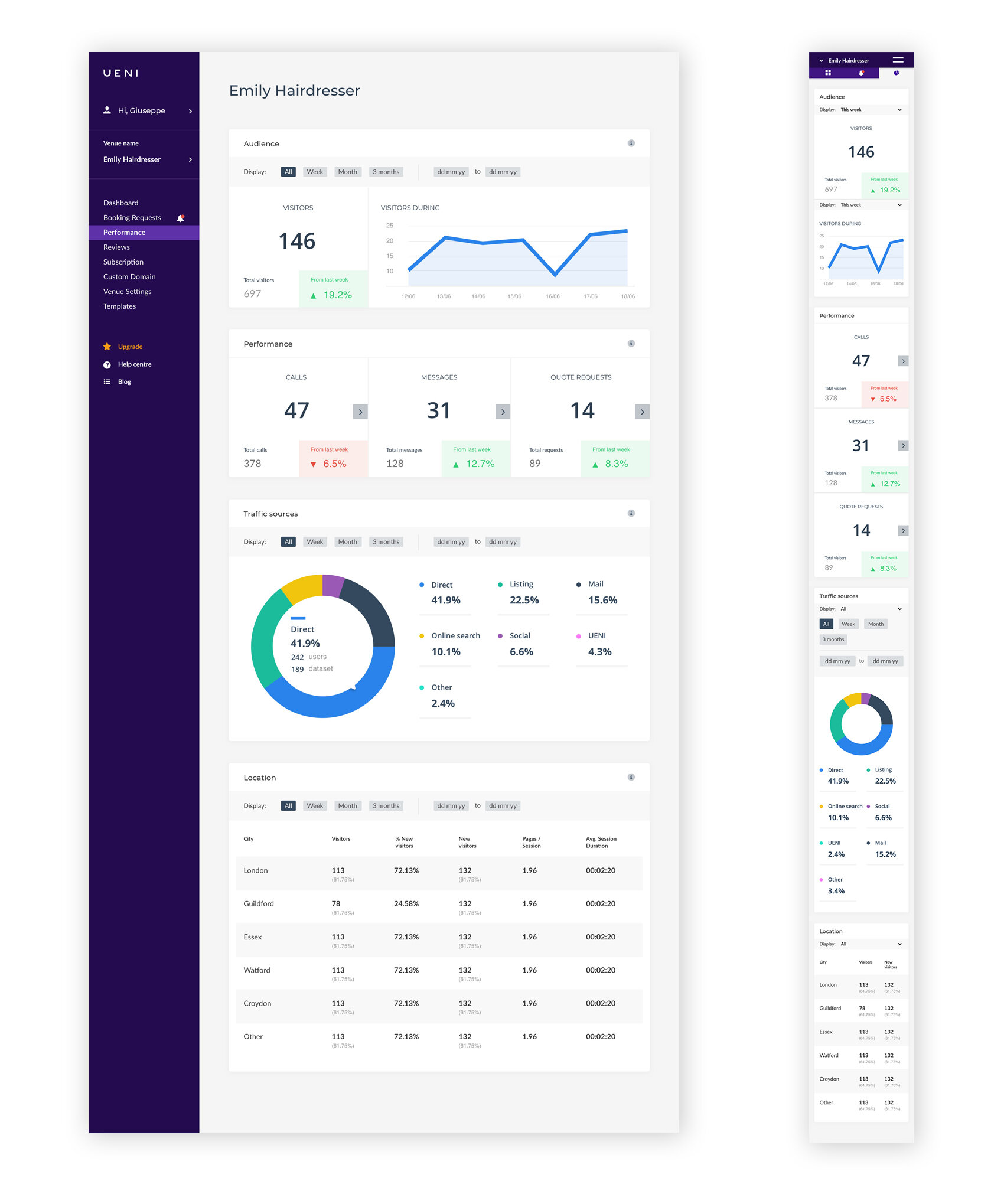
Re-skin the UI of analytics page, and initial update to UX of customer hub.

The Old UI
Here is the old Analytics dashboard. This was the first section of the UENI product hub to be updated. The aim of this project was to make this page more engaging to customers. Things like, improving the data visualisations, giving them a better understanding of the continuing value of the product. This was also an opportunity to improve the UX with an exposed side panel for easy navigation around the Hub, without hiding things in the dropdown menu in the navigation.

The Solution
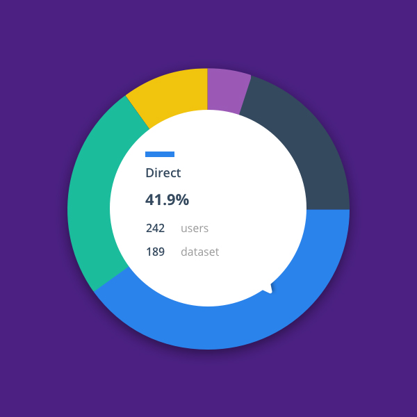
Add a more colourful selection of graphs to make the page more engaging. Highlight areas of interest using green to show positive increase and muted red if there have been any negative changes to performance.
